Case study: E-commerce Wishlist
Overview
In the Uselets wishlist section, the user can favor products that are saved on a page associated with their profile. After verifying a growing number of products favored by each user, the need arose to leverage conversion at this point.
Problem
The wishlist section was developed through a process of deriving the traditional showcase of the site, following the same grid and style guides. It had no peculiarities of its own that set it apart from other storefronts in the user's view, except for the ability to insert and delete products as desired.
Research
After benchmarking 10 other fashion ecommerce competitors, I found that all of the wishlist sections of these sites were visually similar: basic functionality of tagging the product and displaying it in a showcase-like list with restricted login access of user.
After brainstorming meetings with other teams, new ideas emerged to innovate the process of user interaction with the wishlist area. The main idea voted on was the possibility for the user to expose their favorites to others.
Process
From there, I had the idea of separating the favorites area into two interfaces: editing and viewing. I was responsible for devising a new way for the user to show their wishlist differently from those analyzed in the existing market, with the concern of avoiding direct association with a conventional e-commerce showcase. For this, I listed as objectives:
- - View larger photos
- - Alternative visual concept, different from a showcase grid
- - Hide hidden product purchase information: values, buttons, stamps
- - Adaptation dependent on number of wishlist products
The main internal barrier, compared to other departments, was the acceptance of hiding product prices on this screen. My argument was based on the visual aspect in which only the product images would be sufficient as a visual element, avoiding references to any type of showcase. My intention would be for the user to have a similar experience to acquiring a more personal photo collection.
My inspiration was the Pinterest product list, which had a distinctive overall display grid, while allowing you to see appealing elements like buttons and product pricing. The goal was to achieve the same fit fluidity between the product cell pits.
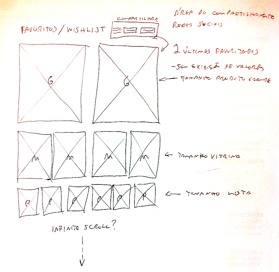
Wishlist preview page sketch:
Direct prototyping in code
Instead of going to the wireframes, I started prototyping the meeting draft wishlist straight to frontend. This process was justified by the use of Masonry, a javascript layout grid library, where you can design different photo display sizes and ensure visual interaction according to the size of the user's view or device. I then started working directly on HTML and CSS defining interactive prototype with low level block structure, using the display sizes for each tile image. I took advantage of the existing patterns in the database for product images.
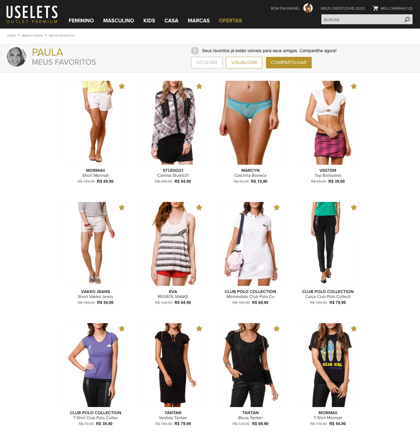
The bookmark editing screen continued as a shop window format, making it easy to delete a product:
After testing content extremes, the wishlist's final watch page went up in production. As planned, the final version contains only product photos. The mouse hover in the desktop version reveals the product name and value, while in the responsive mobile version the click points to the product page. The last favorite photo is displayed in G size. Favorite products scroll through the template according to each favorite added, generating a size change.
Final version of wishlist preview page:
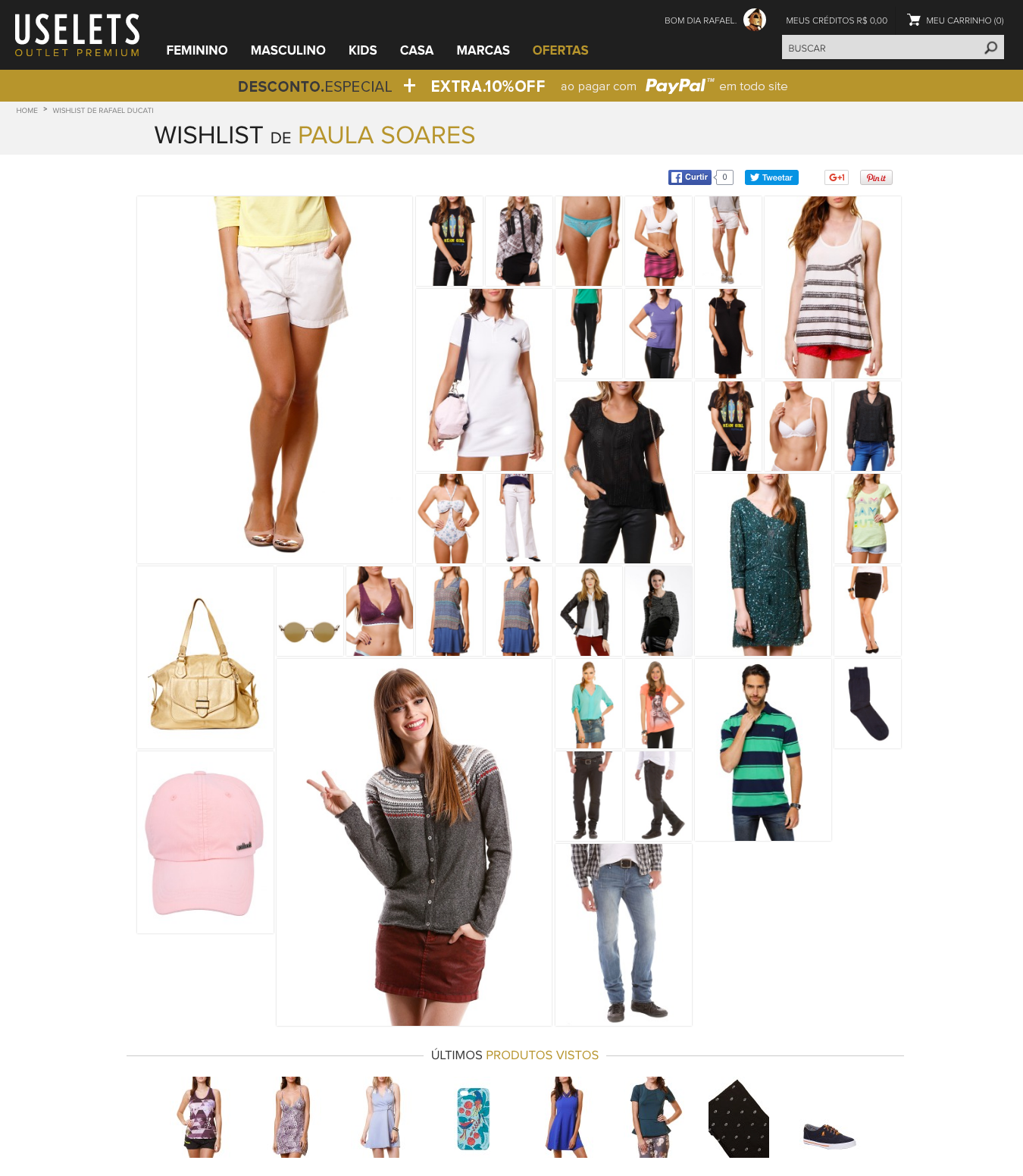
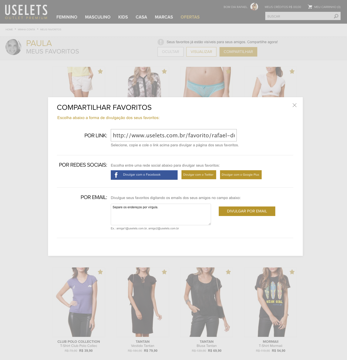
By clicking on the share button, a popup opens and the user can share the wishlist in 3 different ways: by spreading the wishlist link, via social networks, and by email list.
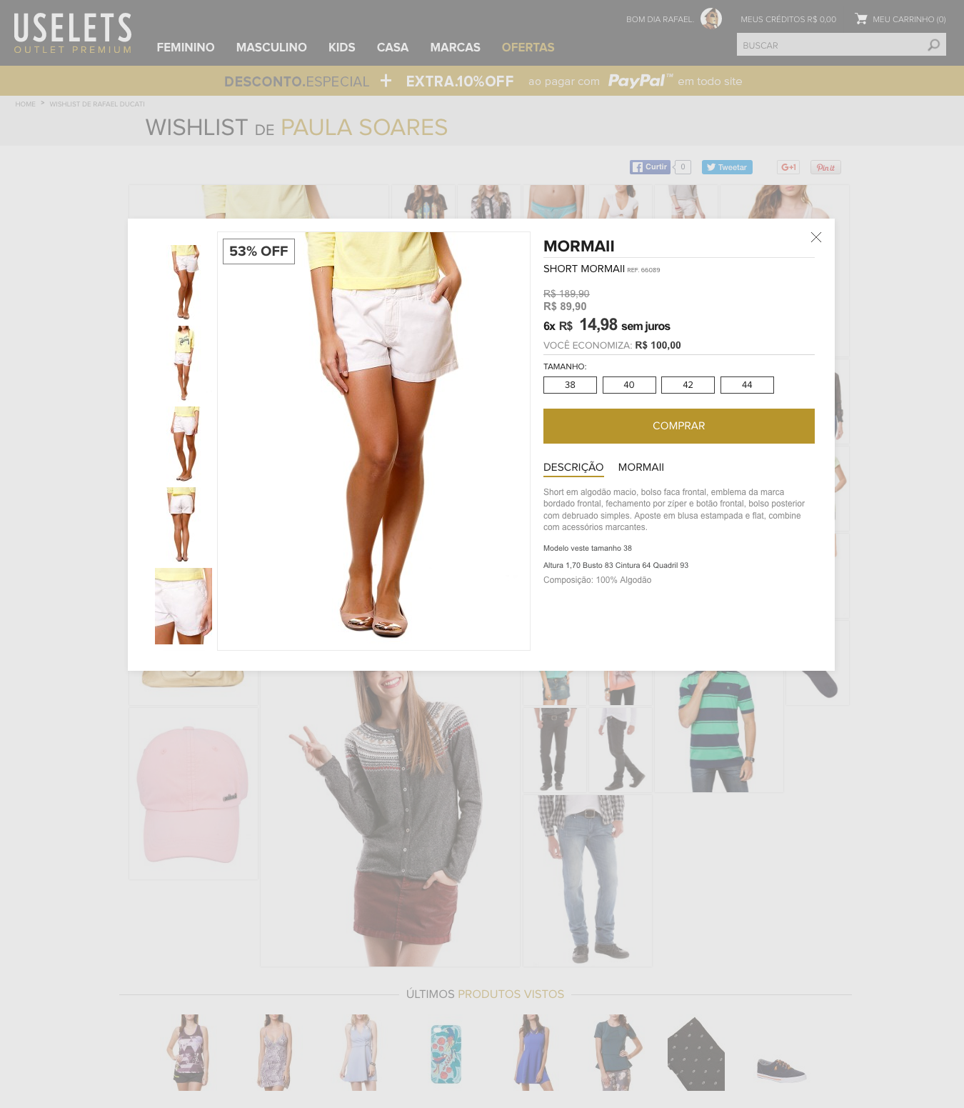
If the user wants to buy a favorite from their list, just click on the product and a popup with a quickview will appear.
Results
User testing
Tests were conducted with 9 users, where:
- - 4 users did not want to disclose their favorites list, but approved the new graduate: they found the new format more interesting than the old edit / view list.
- - 5 users approved the new visualization format, saying they would disclose it to their contacts.
- - 2 users preferred the old view. The reasons were: they didn't need to promote their favorites, they don't use the favorites, they wouldn't remember to access the favorites.
- - 2 users did not notice the share button and did not reach the wishlist preview page.
